Compose your header by combining several images – Photoshop

Not all of us are happy with the image that blogger gives for the header.. sometimes it doesn’t fit well with the concept of the blog…. and searching the internet for a relevant picture that conveys the idea behind your blog(Title) is time consuming and cannot guarantee success.

You may have a certain collection of pictures… when put together might give a boost to the appearance of your blog… but don’t know how to go about it… Never mind.. just read the instructions and you will have your own custom header… Checkout the Header here

Just for starters.. I have two images here.
JUST 4 PICS PUT TOGATHER…. NO SPECIAL EFFECTS-

Here…I HAVE MERGED THEM TO GIVE A SINGLE-PIC-LOOK
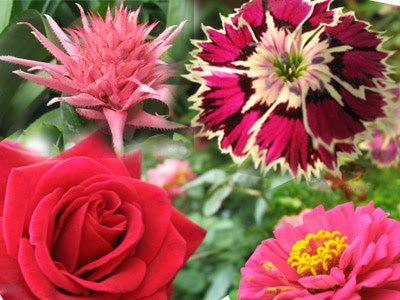
The idea is to combine the 4 pictures and create a new one that appears to be a single picture…. I have used 20 images to create a custom header for My Photoblog.. check it out

I have used Photoshop to achieve this effect.. Few important guidelines before going about creating your custom collage
PHASE-1

  1. Decide on the dimensions of the final picture you want (normal header is 980 x 200)
  2. Create copies of the pictures u want to collaborate ( this way you always have the originals to fall back on incase your attempts go hay-wire)
  3. Get used to working with the TRANSFORM OPTION…….
    • Resize the picture window.. so that you can clearly see all 4 corners ( by clicking and dragging the right corner of the picture window)
    • Select the entire picture — Ctrl + A
    • EDIT-FREE TRANSFORM (or)—-Ctrl +T
    • Notice the change in the cursor when you position it over  the anchor points (change to double headed arrows) at the corners and in the Left &Right sides (and) at the Top & bottom
      • Click and drag the points in the sides.. .. this will alter the width of the picture
      • Click and drag the points at the top / bottom .. .. this will alter the height of the picture
      • Click and drag the point at the corner.... will alter the width & height at the same time
      • Click and drag the point at the corner while keeping the SHIFT key pressed…. will alter the width & height  and also maintain the ratio between the height and width
    • Notice the cursor change to circular shaped arrow when positioned at a certain angle in the corner
      • Click and move the mouse…. this will turn the picture at an angle
    • Hit ENTER once you have decided to apply the changes
    • IF you donot wish to apply changes.. click on any tool… and a message-box will  pop up asking if you would like to apply the changes.. just say DONOT APPLY
  4. Some information about Layer Mask  ( IMPORTANT.. WE WILL BE USING A LOT OF THIS HERE)
    • As the name suggests… it links to the layer which holds your picture
    •  WHILE DRAWING ON THIS LAYER… those areas are rendered invisible in the picture ( I WILL TELL YOU HOW).. this is called masking selective areas in the picture
    • In case you have masked the wrong area.. and want to undo.. use CTRL+Z
    • Even after undoing.. you are not happy… no need to panic and delete the entire file
    • Just right click on the link symbol  that appears between the image and the mask   
      … and give DELETE LAYER MASK
    • Your picture is again back in its original state
    • You may add a new Layer Mask and continue with masking the way you want it to be
  5. Start with a 400×300 image that holds 2 images….. just to get acquainted with the whole process of the before and after appearance … before trying the 980×200 image for header

PHASE 2—–INSTRUCTIONS TO CREATE YOUR COMPOSITE HEADER

  1. Open Photoshop and create a new file giving the dimentions …. Lets name it Collage.psd
  2. Have a Transparent Background
  3. Open the all the images that you want to combine…( ALWAYS SAVE YOUR ORIGINAL IMAGES AND … USE ONLY THE COPIES HERE)
  4. We are going to resize & transform the images so that they fit into the New file.. ie Collage.psd
    1. Select IMAGE-1 and use the TRANSFORM TOOL  to resize and rotate ………….. PHASE1–STEP3
    2. Apply changes by hitting ENTER
    3. You will notice that the resized picture is already selected …(take care not to click anywhere at this point)
    4. Copy using Ctrl+C  ( or Edit- Copy)
  5. Click on the New file …Collage.psd
    1. Paste using Ctrl+V ( or Edit-paste)
    2. You will notice that the image is added as a new layer in your layer pallete
    3. If the resized image is too large / small… donot worry.. just click CTRL+T to transform the image
    4. Increase / Decrease the size… or rotate the picture… and hit ENTER when you are satisfied
    5. Use the Move Tool to move the IMAGE-1 at a position you feel best
  • Follow STEPS 4 & STEP 5 till you have all the images positioned neatly and arranged according to you wish
  • Save the Collage.psd frequently so that you donot loose any changes… Once you are satisfied with the manner of arrangement of the pics… you may close the individual pictues
  • You may notice that they overlap with once another… and certain pics are displayed only half… here is where the magic of Layer-Mask starts
  • Its advisable to start from the topmost layer and then work towards the layers positioned at the bottom
    1. Select the layer whose areas you want to render invisible… and look here at the bottom of the layer pallete
    2. Click on in the layer palette to add the layer mask
    3. You will notice that the image layer has changed to this
    4. Notice the double outline around the Mask-Layer… this means that the "Layer Mask in selected"
    5. Always make sure that the Layer Mask is selected when you begin the Masking process
  • The Process of Masking the areas in the image which you donot want to be seen
    1. Make sure that the MASK LAYER IS SELECTED
    2. Click on the Brush-Tool … if you see a pencil the
      n click and hold the mouse button down a little longer… you will see the brush… then click it
    3. In the Brush Tool bar ( Seen at the top… just below the Menus)… … click on the down arrow to adjust the diameter of the brush…ie… make the brush large / small
    4. Similarly adjust the strength / hardness also
    5. Select the various styles of hardness from the list given
    6. Make sure that the foreground color is black
    7. Once again make sure that the MASK LAYER IS SELECTED.… the double outline at the mask layer
    8. Now just click on the image.. at the area which you wish to conceal
    9. Notice that the particular area is faded & erased.. revealing the image underneath
    10. Also notice that the Masked-Layer (in the layer palette) will show patches exactly in the same areas where you had concealed.. SAVE collage.psd
    11. Continue procedure…. (h) (i) (j) till you have masked ( hidden) the relevant parts of the image
    12. Once you are satisfied with the appearance of this layer… choose another image ( which is in another layer) and repeat the processes  from STEP-9 ( a,b,c,d,e) STEP -10 (a,b,c,d,e,f,g,h,i,j,k,l)
  • You may notice .. as you slowly start masking the layers.. one by one.. all the pics merge into on another to create a single-picture-look… Save your Collage.psd
  • Now save this image as a jpeg by FILE – SAVE AS – choose JPEG from the dropdown box.. and give a name
  • VOILA !!!… your own custom collage is now ready for upload to be displayed
  • Hope I have included every conceivable obstacle that you might face… incase I have missed out any do let me know by dropping a word at the comment section.. Once you get the feel of working with Layer Masks… there is no stopping at the effects you can achieve in matter of minutes. I insist that you experiment with the procedure listed above by choosing 2 pictures and merging them as one… by using layer masks…

    Once your Eyes & hands work in synchronization … then you can go about merging ‘n’ number of pictures to give yourself a customized image that can be used in the header – background .. or just plain composite image .

    If this post has been helpful to you.. do drop a word of appreciation. Your appreciation is my motivation

    Paint.net – Free Image editing tool for those who cannot afford Photoshop

    Photoshop is THE TOOL for image editing… and there can be no second opinion about it..( Ask some die-hard Photoshop fan.. we can come up with umpteen reasons.)..However.. not all can afford to get a copy of Photoshop and the trial versions don’t last more than 30 days & they don’t include all the features that are otherwise available in the complete versionFor those who cannot afford Photoshop… help is near.

    With the .Net technology gaining pace.. can MSPaint be far behind. We have a newer version of Paint called the Paint.net. This is a freeebee so anyone can download it for free (just a click away..and only 1.4MB).. and you get the full version ( so no alert messages telling that the trial period is going to expire soon.). What makes this a great alternative tool for image editing is… its interface is very user friendly…It has all the tools and MSPaint and most of the tools of Photoshop.Moreover they have a Forum to help newbies and a Wonderful Blog telling about the recent updates-features-and many more

    About Paint.NET
    Paint.NET is free image and photo editing software for computers that run Windows. It features an intuitive and innovative user interface with support for layers, unlimited undo, special effects, and a wide variety of useful and powerful tools. An active and growing online community provides friendly help, tutorials, and plugins

    1. Every change you make can be performed in layers.. so that .. incase you are not happy with the change… you can delete the layer .. while retaining other changes made
    2. You can add new layers to brighten your otherwise dark picture ( incase you forgot to turn the flash on)
    3. You can correct the Red-eye.. ( so nomore last minute fiddling to enable red eye in camera)
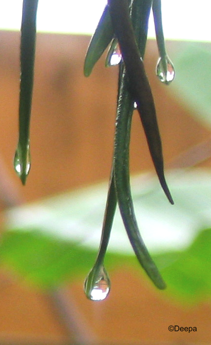
    4. You can add your own signature Text .. like © Deepa…adding your own copyright..(coool isnt it??)
    5. Supports all major picture formats ( except for Animated Gif files)

    And many many more option… Explore and you will not be dissappointed… The posiblities are immense.. after this.. its your imaginatrion and Paint.net.. They also have a Forum to address user Queries.. So any query.. however trivial.. there is always someone to guide you.

    Here I will just give a small intro on how to add your copywright mark to the pic

    Copyright is something like “© Deepa” which I put in the pictures that I upload to the net.. which means that this pic is entirely mine .To do this is Photoshop.. we need to use the “custom shape tool”… however in Paint.net.. this is the procedure to add © to the pics

    Remember always create a copy of the original picture to work on.. Try not to make any changes .. however slight to the the original.. You may end up loosing a perfectly good picture.. incase the alterations does not come out right

    1. Open the picture to which you want to add your ©  mark
    2. © is a special character.. so you will have to open the "Character Map"
    3. START-RUN -Charmap.exe  .. or Start-Programs-Accesories-SystemTools-Character Map
    4. Locate the ©  as shown here
    5. Either double click the ©  symbol.. or clcik the select button ( or make a not of the "KEYSTROKE combination as shown in the pic"
    6. cick the Copy button
    7. Open the Paint.net window( where you have the pic already opened) and select the Text Tool

    1. Click at the position where you want the copyright stamp to appear.. ( Its wise to have this stamp at any of the corneres.. so that people can admire the picture withought gettng distracted by the stamp)… Dont worry if the position didnot match exactly with what you had in mind…. There is something called as "moving the text"
    2. Once the Cursor blinks.. just paste using Ctrl+V ( or Edit Paste.. or use the KEYSTROKE COMBINATION ).. you will see the ©  appear.. following which you can type your name / time stamp of the photo.. etc etc

    1. You many also choose the font size / style and color
    2. Inorder to move the "TEXT" that you have just now added… just click and drag the Square like thinggy to the postion that you might feel appropriate
    3. Save the Picture as Jpeg once you are satisfied with the changes…

    Do drop in with a word if this post has been useful to you.. also..please express your appreciation by linking back to this post.. after allYour appreciation is my motivation

    Lightbox code to zoom ( enlarge) pictures without moving away from your blog

    After receiving a request from Priya, who is very much interested in photography and wanted to have her photoblog in blogspot. But the only thing that was refraining her to do so was.. the behavior of blogger to show the enlarged version of the picture in a new window. Like many other’s she too felt that this would inadvertently take here viewers away from her page.

    In this quest with priya.. i landed at an excellent lightbox code at Huddletogather by Lokesh. This entire script( s) is Lokesh’s work and I am putting this here to let my readers know as to how wonderful this feature is.. A must have for any photoblog.. Even otherwise..its a great way to zoom the pictures in your blog..See it in action here. Read more for instructions on how do this

    1. SAVE AND BACK UP YOUR TEMPLATE
    2. Add the following lines just above the </head> tag in your template
      <script type=”text/javascript” src=”http://deepa7476.googlepages.com/prototype.js”> </script>
      <script type=”text/javascript” src=”http://deepa7476.googlepages.com/scriptaculous.js?load=effects”> </script>
      <script type=”text/javascript” src=”http://deepa7476.googlepages.com/lightbox.js”> </script>
      <link rel=”stylesheet” href=”http://deepa7476.googlepages.com/lightbox.css” type=”text/css” media=”screen” />
    3. You may choose any of the layout provided by blogger for uploading pictures ( Small – Medium – Large).
    4. If you notice the html part of the image code you will see something like
      <a href=”url of the picture at blogger”>
      < img src=”url of the pic..the full size” style=”width – height etc depending on the layout”/>
      </a>
    5. Here is what you need to do to activate the lightbox code
      <a href=”url of the picture at blogger” rel=”lightbox”> < img src=”url”>
    6. If you wish to show the pictures as collection (…say..flowers..animals..etc etc).. then all you need to do is

      <a href=”url of the picture at blogger”
      rel=”lightbox[flowers]” > < img src=”url”>
      <a href=”url of the picture at blogger” rel=”lightbox[flowers]” > < img src=”url”>
      <a href=”url of the picture at blogger” rel=”lightbox[flowers]” > < img src=”url”>

      <a href=”url of the picture at blogger” rel=”lightbox[picnic]” > < img src=”url”>
      <a href=”url of the picture at blogger” rel=”lightbox[picnic]” > < img src=”url”>
      <a href=”url of the picture at blogger” rel=”lightbox[picnic]” > < img src=”url”>

    7. The above step does not involve blogger labels… so no conflict on codes.
    8. Remember that the lightbox code will get fuctional only after the entire page loads.

    This code works for me and I hope this works for you too. Drop a comment and let me know

    ADD ON:-
    If you want to have a “Zoom Cursor” appear over your pictures as shown here.. the this is waht you need to do
    LOCATE THE FOLLOWING IN YOUR TEMPLATE
    And add the line shown in red.
    .post img {
    cursor:url(http://deepa7476.googlepages.com/ZoomIn.ani);
    }
    This is best viewed in IE. I dont know if FFox supports cursors in Stylesheets.

    Your appreciation is my motivation
    Random Banner Display for your blog

    Bloggers who use AdSense in their blog would like to have various banners displayed. But having them one below the other (or) one beside the other is cumbersome and space consuming. The blog-space is precious… so you cannot afford to waste even one pixel of it.. particularly if you are using Adsense

    Lets say you have about 3 banners which you would like to display in your blog.. but alloting seperate space for each would make your blog look crowded. So how would it feel to have a specific space ( certain width and height) allotted , and the banners are flashed on-and-off while the reader is viewing the contents of your blog.To get a fair idea..look at the bottom of this blog.You can incorporate this into your blog..just follow the instructions closely. Its more advisable if the banners have the same width and height…( this will improve the looking-feel)

    1. Save and Backup your template
      ( eventhough you are dealing with a single HTML widget)
    2. Template-page Elements – Add Elements
    3. Add a HTML widget
    4. Add the following script code
      <script src="http://deepa7476.googlepages.com/Rotating_banner.js">
      </script>
    5. Then add this
      <a src=”http://www.hotspot.freeserve.co.uk/scripterlative/bn4.gif” href=”#” name=”myShow1″>
      <img
      height=”49″ width=”335″ src=”http://www.hotspot.freeserve.co.uk/scripterlative/bn1.gif” name=”img1″ />
      </a>
      You may alter only the height and width property of the above <img> tag.
      Its advisable not to change anything else..coz.. this <img> holder will be responsible for the display of banner. I don’t think you would want to mess with that
    6. Add this
      <Script type=”text/javascript”>
      RBanner.show(‘myShow1′,’img1’, 2, false,
      URL_of_Banner1 ‘,’http://www.BANNERSITE_1.com’,” Text_On_MouseOver“,
      URL_of_Banner2 ‘,’http://www.BANNERSITE_2.com’,”Text_On_MouseOver“,
      URL_of_Banner3 ‘,’http://www.BANNERSITE_3.com’,”Text_On_MouseOver“,
      URL_of_Banner4 ‘,’http://www.BANNERSITE_4.com’,”Text_On_MouseOver
      );
      Lets now see the Structure of STEP-4 ( Advanced users may view instructions within js file)

      This has 4 pictures used as banner, and each banner is displayed for about 2 seconds.If you wish to add more pictures just repeat the lines in exactly the same order…remeber.. the last image – URL- MouseOverText does not have a comma (,)

    7. Once you have replaced the appropriate Banner pictures- respective URL’s – and the respective Text that is displayed when the mouse is moved over , you may save the widget and view you blog
    8. This has worked out well for me.. Hope the same for you too

    Do let me know what you think about this.Credits to scripterlativeYour appreciation is my motivation

    Create your own Animated pictures

    Sometimes we would like to create our own animated gif files..It could be either using 2 ( or more) picturtes available with us ( say some of own digital photos) or comming up with your own creation of an animated picture

    Here I have use 2 existing jpeg files and put them in a loop so that both the pics appear on and off
    Here I have
    used a collection of pictures to create the effect of opening and closing of a Star as a single animated gif file….I found geometric designs to be easy for learning puropse…and i have used 6 bmps here

    In order to be able to do this.. you need to have Photoshop / Image-Ready already installed .. you must be willing to give yourself some time to learn about the workspace get used to the environment…Follow the instructions carefully

    1.THE PREPERATION

    1. If you are going to create your animation form your existing collection of jpegs.. then I suggest taht you copy them and place them in an exclusive folder in your hard disk..say C:\Testing_animation
    2. Say you are using Pic1.jpeg & pic 2.jpeg
    3. It is adviable if the pictures have same width and/ or height for best visuals
    4. I have used Photoshop CS2 to create the animation..But the instructions would be similar for pre-CS2 versions also….(if the Animation option is avilable)

    The Star.gif uses 6 bmp files each with the same 100×100 dimentions

    2.PHTOSHOP CS2

    By now I hope you would have decided on the dimentions of your gif file and chosen the pics accordingly

    1. Open both Pic1.jpeg & Pic2.jpeg in Photoshop
    2. Create a New Photoshop file from FILE — NEW — Sepcify the width and height
    3. Before we actually begin our animation lesson.. Lets see the order of the pictures

      Pic_1 — Pic_2 –Pic1

      Here we will be putting pictures in photoshop in this order using layers

    4. Keep the Layers pallete visible…WINDOW — LAYERS

    All New files will have a default layer which serves as the background

    1. Add Pic_1 to layer1
    2. Add New Layer — Add Pic 2 (Layer 2)
    3. Add New Layer — Add Pic 1 (Layer3)…this is to give an impression of loop
    4. You may name the layers appropriately
    5. Donot worry over what you may see on the image canvas at this point of time
    6. I have given the layer palette of my star.gif where I have used bmp’s
    7. The layers are named for quick refrence
    8. Save this file in psd format … so that you may reuse for editing in photoshop againAlso save a backup copy ( psd format) at this point on
    9. Make sure that the pictures are well arranged in the layers .. in exactly the same order as you want them to be displayed in the gif file
    10. You may rearrange the layers by click-and-drag methord

    3.THE ANIMATION PROCESS

    1. Now you must have your pictures in the desired sequential manner in the respective layers
    2. Make sure only the first layer (first pic to be displayed) has its EYE TURNED ON… Rest all the layers must have its “eye-turned-off”
    3. You may see in my layer pic that only the ist layer has the “Eye” icon.. all the other lauers donot-have-eye-icon
    4. This can be done by selecting the respective layer and clicking on the “Eye”
    5. Enable the animation pallete WINDOW — ANIMATION
    6. Since all the required pictures are arranged in layers…we need not worry about adding indivivual frames and modifying them
    7. We can convert all the layers into frames using the option given in the animation palette
    8. SEE PICTURE
    9. this will convert all your layers into frames
    10. The technical-know-how is…..Cick on each frame and see that only its corresponding layer will have the EYE-TURNED-ON…..Rest all layers will have its eye-turned-off
    11. You may set the time for each frame..at the location specified in the pic
    12. Use the Play-buttond to see the animation. (inside photoshop)
    13. Once fully satisfied you may use the FILE — SAVE FOR WEB — GIF FILE
    14. Now you have a Gif file in the folder..view the gif file in IE
    15. You may now upload this gif file and display it using <img src= ” ___ “/>

    IF this post has been helpful to you..kindly leave a comment and express your appreciation by linking back to this post.
    Your appreciation is my motivation
    Flickr Badge – Your pesonalised photo gallery

    There have been times, when you are just bcak from a vactaion..or you have captured some really intresting moments in you camera , its only natural that you would like to share them with the friends online..If its one or two pics, you would include them in a post with a small description..The drawbacks being

    1. This is advisable for min number of pics ( 1-5)
    2. More number of photos will put more load on the browser
    3. As you make the newer posts.. the pictures( in the specific post) are pushed down the archive
    4. Eventually, it will dissappear from the view of the ordinary reader
    5. This gives only limited viwership with limited number of photos


    However, inorder to avoid these.. you may host your pictures in online photo-albums like Web-shots , Photobucket , Flickr, Gallery,Slide, JAlbum and then provide the link to the album at the respective sites..Yet again.. this would redirect the viewer from your page.

    So, how would it make you feel..if you had a photgallery right in your sidebar..at all times..so that..the viewer sees the preview of the pictures and click on the pic that intrests him the most.

    The most singular option that came to me is the Flickr Badge,You can see the gallery in action in the Right-side-bar immediatly above the Shout-box .This is simple, Easy to do, and does not involve any kind of HTML skills . Just follow the instructions carefully

    Thanks to Kat who suggested Slide.com.Its also simple and gives the liberty of preparing Sideshows..with 3 levels of speed (Slow – Medium- Fast ).The sideshow created usng slide can be seen here at my TestBlog

    INSTRUCTIONS FOR FLICKR

    1. Signup with Flickr
    2. Primary signup is using your yahoo ID..however you can choose your own flickr Id in the subsequent steps
    3. After Signing up, you may upload your pictures (declare them as Public or Private and categorise them using Tags (..they are just like labels.. you name a certain bactch of pics as vacation , Birthday, nature, etc etc )This tagging comes handy while we do our gallery
    4. Once you are satisfied with the uploaded photos , tagged them wisely we can proceed to make out Flickr Badge
    5. You may choose to have a HTML-Badge or Flash Badge
      • My personal choice is Flash badge..as i feel its compact and puts less pressure on the browser

    6. Next you may select a certain-batch-of-Pics that you want to use in the gallery by giving the Tag name
      • i.e you may create individual galleries for the various categories of picture you may have
      • You just need to tag them appropriatively

    7. The Next part is easy..You just need to give color to borders, texts etc..You may even choose not to have a backgound / border
    8. Finally.. you just copy-paste teh code given by flicker to your sidebar HTML widget

    INSTRUCTIONS FOR SLIDE

    1. Sign up with Slide.com
    2. Clik on MAKE SLIDE SHOW
    3. If you already have an account with Flickr , Myspace , Photobucket etc.. you need not upload the pics again.. you can give directly upload them to silde from your photo-sharing network
    4. You may give various customisations like Style , Themes, Skins, Size etc..While giving the size specification..take care the Width is atleast 5px less than that of your sidebar..That way you can avoid the sidebar / post section from dropping down
    5. Once you are satisfied with the pictures and given them appropriate captions..,Click SAVE
    6. Choose from the various options among the following for the respective codes
    7. eBay MySpace Blog Wretch BlackPlanet
      Live Spaces Yahoo! 360 Piczo Xanga
      MySpace Facebook TypePad LiveJournal
      Geocities AOL Journal Old Blogger New Blogger
      AIM Pages Multiply Tagged FreeWebs
      Bebo Hi5 Friendster

    8. Copy the Code and paste in a HTML widget at the position of your choice

    Voila..Your-own personal picture galleray /Slide show is now up and fuctional for everyone to see and relish.Hope you liked this…

    Change the image when the cursor moves over it

    Many of you would have noticed that in certain websites,especially the ones with Advts, when you move the cursor over a certain image, it changes to another eye-catchy image.Now you too can give that kind of an effect in your blog with pictures that are chosen by you.Still a bit hazy,.. just move the cursor over the images below
    NOTE:- You must have Javascript enabled in the browser

    • We shall be using two images to get this kind of the effect.
    • There shall be slight modifcations in the code depending on
      1. Both Images have SAME dimentions (width & height)
      2. Both Images have DIFFERENT dimentions
      3. The Images LINK-TO another URL / site
      4. The images DONOT LINK-TO any other URL/Site
    • Any combination of the above ..such as
      1. Both Images of the SAME dimetions AND link to another site
      2. Notice the change in the appearence of the cursor (“hand-shape” icon)

      3. Both Images of the SAME dimetions DONOT link to another site
      4. Both Images of the DIFFERENT dimetions AND link to another site
      5. Notice the change in the appearence of the cursor (“hand-shape” icon)

      6. Both Images of the DIFFERENT dimetions DONOT link to another site

    Both Images of the SAME dimentions LINK-TO another site


    <A
    href=”URL_of the site onmouseover=”document.Same_size_LINK.src=’MOUSE-OVER-PIC-URL‘” onmouseout=”document.Same_size_LINK.src=’NORMAL-PIC-URL‘”>

    <IMG SRC=”NORMAL-PIC-URL” NAME=”Same_size_LINK” WIDTH=”100″ HEIGHT=”50″ BORDER=”0″ >

    </A>

    Both Images of the SAME dimentions DONOT link to another site


    <A onmouseover=”document.Same_size_SELF.src=’
    MOUSE-OVER-PIC-URL‘” onmouseout=”document.Same_size_SELF.src=’NORMAL-PIC-URL‘”>

    <IMG SRC=”NORMAL-PIC-URL” NAME=”Same_size_SELF” WIDTH=”100″ HEIGHT=”50″ BORDER=”0″ >

    </A>

    Both Images of the DIFFERENT dimentions LINK-TO another site


    <A
    href=”URL_of the site onmouseover=”document.Different_size_LINK.src=’MOUSE-OVER-PIC-URL‘” onmouseout=”document.Different_size_LINK.src=’NORMAL-PIC-URL‘”>

    <IMG SRC=”NORMAL-PIC-URL” NAME=”Different_size_LINK” BORDER=”0″ >

    </A>

    Both Images of the DIFFERENT dimentions DONOT link to another site


    <A onmouseover=”document.Different_size_SELF.src=’
    MOUSE-OVER-PIC-URL‘” onmouseout=”document.Different_size_SELF.src=’NORMAL-PIC-URL‘”>

    <IMG SRC=”NORMAL-PIC-URL” NAME=”Different_size_SELF” BORDER=”0″ >

    </A>

    POINTS TO REMEMBER

    1. In the &IMG NAME=” tag make a note of the NAME specified
    2. Consider CODE:-4
      <A onmouseover=”document.Different_size_SELF.src=’MOUSE-OVER-PIC-URL'” onmouseout=”document.Different_size_SELF.src=’NORMAL-PIC-URL'”>

      <IMG SRC=”NORMAL-PIC-URL” NAME=”Different_size_SELF” BORDER=”0″ >

      </A>

    3. The NAME of the < IMG tag is repeated on its corresponding <A onmouseover=”document.Different_size_SELF.src=’MOUSE-OVER-PIC-URL’ onmouseout=”document.Different_size_SELF.src=’NORMAL-PIC-URL'”>
    4. So if you plan to have more than 2 sets of such images , then its necessary that you have different NAME in the < IMG NAME =
    5. And use the corresponfing NAME only in the respective < A tag

    Thank you for dropping by here..Hope you enjoyed the session.If you are very much satisfied , kindly leave a comment 😀

    Replace Blogger's Email link-pic with Pic of your Choice

    Do you Remember the Email-Post icon provided by blogger..pretty mundane isnt it ?.. Now see the Email-link below this post..Howzz it ?..nice hmm..

    Thats because I replaced the Blogger-Email picture with your customised Email-Pic..something thats more eye-catchy..Intrested..Read along

    1. Make sure that “Show Email in Posts” is turned ON
      • Template – Page Elements
      • Click on EDIT of BlogPosts
      • Enable the Email link by selecting the checkbox
      • Save and view teh blogjust to make sure that the email link is shown
    2. Make sure taht the image you intend to use is already uploaded to some webserver like Ripway, Fileden etc and save the URL of the Picture_file onto a notepad
    3. SAVE AND BACKUP YOUR TEMPLATE
    4. Locate the lines in Blue
      • Delete the lines in RED
      • Add the lines in GREEN


      <!– email post links –>
      <b:if cond=’data:post.emailPostUrl’>
      <span class=’item-action’>
      <a expr:href=’data:post.emailPostUrl’ title=’Email Post’>
      <span class=’email-post-icon’> </span>
      <img src=”URL of the Picture“/>
      </a>
      </span>
      </b:if>

    5. Voila..View your blog

    Hope You are Happy with what you see..Go ahead and get those changes going..Dont forget to backlink to this post..when you are satisfied and all set-up..Your appreciation is the greatest motivation for me

    Using Scroll Box to show Really Large Pictures

    Say you need to post a really large picture in you post..perphas the picture’s width and height extends far beyond the boundaries od you blogpost / sidebar..Top avoid gettimg messed up with the layout-presentation of the blog, you would wisely link to the picture and provide the link in your blog.=d>

    The Picture that you see here has

    WIDTH=972px
    HEIGHT=595px.

    If I had added this picture directly.. i am sure it would not have been a pleasent experience for me & my readers.;;)

    You can see the full-Picture here to get an idea abouts its dimentions.

    So I have displayed the picture in a scrollable-area called as the

    <iframe></iframe>


    To add such a scrollable area to your blog (post or sidebar) all you need to do is insert this one simple line of HTML code :-B

    <iframe src=”
    URL of the Picture” frameborder=”0″ height=”300″ width=”300″>
    </iframe>

    Take care that the WIDTH of the iframe is atleast 20px less than that of the post (or) Sidebar..where you want the frame to appear.The reason being, out of the entire width specified in the iFrame some of it is used to display the scrollbar

    Liked this.. Start using..A Backlink to this post will be appreciated

    Add Yahoo emotions (Smileys) to your Blog

    Hello all 🙂 .. Welcome to this blog >:D< ..Its now possible to add yahoo smilies like =)) , :-? , :O3 , and many more to your blog by using the without using the <img> tags. You can type in : ) to get the :) ... in short you can use the same keys as you would use in the yahoo messenger to get the appropriate smileys <:-P.Thanks To Aditya of Last Word..it was he who first developed this with basic set of smileys..However i have modified the script so as to accomodate all major yahoo SmileysThere are about 85 such smilyes #:-S (including the hidden smileys). you can use the same keys as listed in Yahoo Emotions and Yahoo Hidden Emotions.

    For your refrence i have a TEST POST FOR Yahoo smileys thorough scripts… If you see the “View Source ” you will not be seeing any <img> tags. B-) .. instead you will only the yahoo smiley-keys… which are replaced wiht the Smiley pictures when viewed in the browser. \:D/This way you need not memmorise any new keys to get the smileys on your blog.

    If you wish to use this in your blog, follow the instructions
    If you wish to use any of yahoo the smileys here in your blog.. follow the instructions carefully

    1. SAVE AND BACKUP YOUR TEMPLATE
    2. Add<script type=’text/javascript’ src=’http://deepa7476.googlepages.com/DeepaSmiley.js’></script> above the </head> tag
    3. Save and start posting
    4. A Word of Caution
      • I have seperated the characers with a space in the middle. . you can write them as continious cahracters to get the smiley
      • If you are seeing borders around these emotions that appear in your posts then change this
        .post img {
        padding: 4px;
        border: 0x solid #cccccc;
        }

    I have Slogged pretty long to get this script working..so if you are using this script kindly link back to this post as an appreciatoion for the effort taken.This gesture of your appriciation will motivate me to take up new challenges.